Changing Times, Changing Coalitions: A Look at Six Midwestern Congressional Districts
The Midwest is one of the most fascinating regions of the United States for any election analyst to study. Largely white and working class, it is a hardened American echelon that seems to have undergone more loss and struggle than success and revitalization. For those quintessential working bastions of middle America times have been tough. Depopulation and job loss have been major concerns, with many parents growing up to see their children leave ancestral surroundings for better opportunities elsewhere in the country. The withering of the steel industry, for example, has sucked the life out of regions like the upper Mahoning Valley and northwestern Indiana.
Today's analysis will be looking at six midwestern Congressional seats: Ohio's 9th and 13th, Michigan's 5th, Indiana's 1st, Illinois's 17th, and Wisconsin's 3rd. All but one of these districts encompasses territory that lies within the Rust Belt, a region so-named because of its steady bleeding of manufacturing jobs over the last half-century. A publicly-available map of the region is provided below. Our more politically-astute readers should be able to see that some of the aforementioned Congressional districts correspond with patches of significant loss.
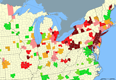
Some of the red regions on this list have survived, and in some cases emerged better from, the marked decline in manufacturing jobs. Chicagoland, the Philadelphia Collar, and the North Jersey suburbs are all perfect examples of this. All three are highly developed and boast financially-stable residents with generally above-average rates of educational attainment. Greater Minneapolis, Nashville, and Charlotte join NOVA and North Carolina's Research Triangle as centers of economic development and business growth. A stark contrast is posed by the red of greater St. Louis, Springfield, northwestern Indiana, greater Detroit, the northeastern part of the Mahoning Valley, and Southwestern Pennsylvania. Precipitous decline has struck these areas particularly hard, and there doesn't seem to be much hope of recovery any time soon.
As one can by now infer, most of these Congressional districts are rooted around areas of decline. Our twofold analysis of these similar seats reaches two conclusions:
- 1) Trends in all six districts have boded well for Republicans at the Presidential level
- 2) Presidential trends have begun to seep into Congressional races, but House Democrats have still outperformed Democratic Presidential nominees in each of the last three Presidential Elections.
Maps will supplement our data-driven foundations as we delve through the politics of the country's heartland. A generous thank you is merited for all the mappers whose work is cited within this piece.
District Backgrounds
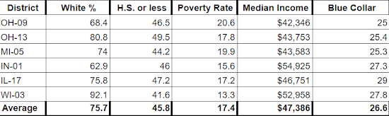
Before we look at election results, we need to contextualize these related districts with some background data. There are four established comparison fields with data drawn from the 2020 Almanac of American Politics: majority racial demographic, level of educational attainment, the poverty rate, median income, and blue collar percentage. These categories link six geographically-disparate parts of the Midwest together in a way that makes comparison easy. We have provided data averages representing our 'ideal seat' at the bottom of the chart.
Race
The average district population is roughly 76% white. This datum is about 18 points whiter than the nation as a whole - which stands at around 57% non-Hispanic white according to 2020 data. At opposite ends of the scale are Wisconsin-3 at 92% white and Indiana-1 at just 63% white. All six districts are whiter than the nation in its entirety. A lot of the recent Republican momentum across the region can be explained by disproportionately high white populations coupled with higher-than-average rates of low educational attainment.
Education
The average level of educational attainment among our district populations is about 46% High School or less. Another way of putting it: nearly half of this hypothetical district did not receive any form of college education. That is higher than recent national figures. New Census reports show that High School or less is the greatest level of education received by just 28% of the population older than 25. Since the 2016 election, educational attainment has become a far more popular way of estimating the political leanings of demographic groups. (The political divide between college-educated and non-college educated whites during the Trump-era is often explainable by level of education controlling for region; i.e. college-educated whites in Rankin County, MS will still vote Republican in droves much like lesser-educated whites elsewhere in the country)
Poverty
Manufacturing decline has contributed to above-average regional poverty rates. The national poverty rate is currently estimated to be around 13%, four points lower than our 17% average. Only Wisconsin-3, the most dissimilar of the six seats, had a poverty rate below the national level. Ohio-9 (Toledo) and Michigan-5 (Flint & Saginaw) both lie above the district average of 17% - at 20.6 and 19.9% respectively. These numbers do not place our six districts anywhere near the poorest in the country, but they do land them in the upper percentile of seats with populations above the national poverty level.
Income
Our district average median income is $47,386 - placing it about $20,000 below the $67,521 nationwide figure reported by the Census Bureau in 2020. As we elaborated on in the poverty section, that number places it in the lower echelon of districts by median income - but nowhere near the lowest.
Blue Collar
The final numbers deal with the percentage of the districts' population holding blue collar occupations. All of the seats fell within a 25-29% range by this metric, with the average lying at about 27%. This constituency is significantly more prominent in our selected districts than in the rest of the country, melding well with the regional background of the Midwest as we have already defined it.
Republican Trends in Presidential Elections
The first point of interest among these six districts deals with favorable trends for Republicans in recent Presidential elections. To analyze this slow-burn manifestation of voter discontent, we'll be looking at changes in vote share for both major parties along with race margin for the last three nationwide contests. There are minute inconsistencies between the various districts, but all of them, on average, fit both of the conclusions we reached. Let's begin with a discussion of margin.
Analyzing margin is always a good place to start when it comes to deriving big-picture conclusions from a small amount of data. As one would expect, the margin is calculated by subtracting the Democratic vote share from the Republican vote share. Therefore, Democratic victories can be associated exclusively with negative numbers.
Let's start with 2012. That year President Obama pulled off a respectable reelection victory, bringing his party out of the wilderness after an excruciating midterm result two years before. Republicans had placed more faith in Mitt Romney than they had in their previous standard-bearer John McCain, but a lot of their added confidence came with the gradual alleviation of the worst effects of Great Recession. After the election, many Republicans believed they had blown a winnable race. The 44th President's margins in the Midwest were markedly decreased from 2008, but remain better than the numbers posted by Hillary Clinton and Joe Biden in the two most recent Presidential battles.
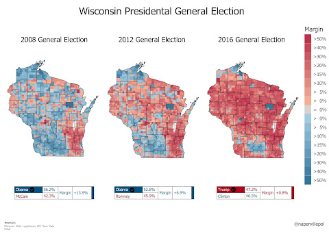
Given the insurmountable national advantage Hillary Clinton was perceived to have over Donald Trump for the entire 2016 cycle, it's not much of a surprise that Clinton's campaign took the Badger State for granted. The first female Presidential nominee didn't even visit the state after receiving her party's nomination over the summer. But the campaign's overconfidence wasn't unfounded. Compared to Michigan and Pennsylvania, Clinton's lead was significantly stronger. RCP's final pre-election average showed the former Secretary of State leading Trump by 6.5 points in Wisconsin compared to just 2.1 points in Pennsylvania and 3.4 points in Michigan.
Bearing these facts in mind, Trump's Wisconsin victory cannot be considered anything other than a massive upset. By less than a point, the enigmatic businessman and reality TV star became the first Republican to carry the Badger State since Ronald Reagan in 1984. Most people attribute Trump's unforeseen 2016 success to his ability to bring out new, disaffected (low-propensity) voters that had not participated before. This was to some extent true, but it wasn't the only reason for his victory. In 2020, for instance, Trump and Biden both brought millions of novel voters to the polls to make their voices heard. Turnout records were sit, but the President still lost reelection.
Looking under the hood gives one the chance to see that Trump's victory in Wisconsin, and much of the remaining Midwest, was just as much the result of Clinton underperforming Obama's benchmarks as it was the result of Trump bringing out new voters and flipping white working class (WWC) Democrats into his camp. Comparing vote share and raw vote figures for both major party nominees between the 2012 and 2016 Presidential contests paints a vivid picture of how elections can sometimes be influenced more by those that don't vote than those that do.
2016 saw Trump receive 47.2% of the vote in Wisconsin, a number not much higher than Romney's vote share four years earlier. That improvement alone normally wouldn't have been enough to flip a state. Far more telling than the slightly-boosted GOP portion was the precipitous six point decline in Democratic vote share between the two elections; Obama received 52.8% in 2012 compared to Clinton's mere 46.5% finish four years later. The same decline manifested itself in the other critical 'Blue Wall' states: Michigan and Pennsylvania. A table is provided below to display these data.
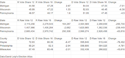
In all three states, Clinton's raw vote total fell in tandem with her drop in vote share when compared against Obama's previous benchmarks. This phenomenon was particularly potent in Michigan, where Clinton's share of the vote was 7 points less than Obama's in 2012. In each state, Trump saw his share of the vote improve relative to Romney's. This was not the case with the raw vote. Trump presided over marked improvements by this metric in Michigan and Pennsylvania, but actually received fewer raw votes in Wisconsin than Romney had four years prior. The lack of true Republican improvement in Wisconsin leads one to wonder how the election might have turned out if Clinton had come close to replicating Obama's statewide performance.
Looking at the three 'critical' counties from each of the three Blue Wall states sheds even more light on the mediocrity of the Democratic performance. In Wayne County (Detroit), the Democratic vote share fell by 6.5 points from 2012 to 2016. That's a raw vote decrease of 76,000 - more than enough to have reversed Trump's 10,704 vote margin of victory in the Wolverine State. Milwaukee experienced a smaller, but still significant, Democratic drop of 2 points - 43,616 votes. Trump won Wisconsin by just 22,748 votes out of almost 3 million cast.
The 2016 election split the Obama coalition asunder in many ways, with devastating consequences for Democrats in the Midwest. Clinton could not meet Obama's margins among WWC voters who had been essential to the party's coalition in years past. A reduction in post-Obama black turnout among the three aforementioned metros certainly did not help either.
@Alexanderao's low-college white classification is a perfect summation of Democratic decline among our targeted demographic over the last decade. Educational attainment analysis is also used to identify voter propensity, since more educated voters are more likely to know when to vote in an upcoming election. Keep these findings in mind as we discuss favorable top-line trends for Republicans in each Congressional district.


With background information out of the way, let's shift over to discussing the six districts in question. We'll briefly touch on each of them after doing some big-picture analysis broken down by the same categories: margin and vote share. A set of introductory tables is provided below to display baseline data from each of the last three Presidential cycles.


Presidential trends have been good for Republicans in all six of these districts. In 2012, the average Presidential margin among them was Obama +23. Eight years later, the same figure was just Biden +5. That's a seismic rightward shift of 18 points. (Only four years ago, the average was about Clinton +7)
Looking at vote share averages for both parties over the same span of time leads to similar conclusions. In 2012, Mitt Romney's average was roughly 38% of the vote. Trump increased that figure to 44% in 2016 and nearly 47% in 2020. Conversely, the average Democratic share has fallen. Obama's average in 2012 constituted around 61% of the vote. Clinton fell to 51% in 2016 and Biden received a slightly higher 52%. Since 2012, the overall change in vote share has been about 9% toward the GOP away from the Democrats.
Congressional Democrats Outrun the Top of the Ticket
Even with these favorable Presidential trends, Congressional Democrats have mostly managed to outrun the top of the ticket in all three cycles. Let's take a short look at this phenomenon of overperformance district by district.
OH-09 The Toledo-based 9th district is represented by long-time Congresswoman Marcy Kaptur. She beat Republican incumbent Ed Weber in 1982 and has not had any reelection difficulties since then. Her district's lakefront boundaries have greatly expanded over the years to make up for population loss in Lucas County. Ahead of the 2012 cycle, the 9th picked up portions of Cuyahoga County to become more Democratic. Kaptur easily beat fellow incumbent Dennis Kucinich in a double-bunking primary and has since been reelected handily under the new lines. In 2022, she will face her toughest challenge yet in Ohio's newly-drawn 9th district - clocking in at about Trump +5. If she wins and serves another term, she will be the longest serving female member in the history of Congress. (The record is currently held by former Maryland Senator Barbara Mikulski) We currently consider the race a Tossup.
Kaptur's reelection margins have shrunk in each of the last three Presidential cycles, but she has managed to outrun the Democratic Presidential nominee on every occasion. In 2012 she got to run in her new district for the first time, winning by 50 compared to Obama's 37 - an overperformance of about 13. Kaptur also drew 73% of the vote, higher than Obama's 68%. Clinton and Biden both received 59% in the district, winning it by margins of 22 and 19 points respectively. Kaptur won by 37 and 26 in the same years, staying above 60% in both instances. Her most recent victory against Rob Weber was the closest under the new district boundaries. Since 2012, the 9th has gotten 18 points more Republican at the Presidential level.

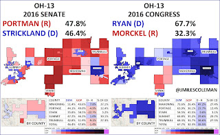
OH-13 Gerrymandered to take in as many Democratic voters as possible, the 13th district stretches from Youngstown to Akron. It is currently represented by Tim Ryan, who mobilized the Mahoning County portion of the old seat to beat Summit County Democratic incumbent Tom Sawyer in the 2002 primary. He has been reelected rather easily over the course of his career, with 2020 being his closest race. Like Kaptur in the 9th, Ryan has frequently outrun the top of the ticket. Ryan is retiring to run for Senate in 2022, leading Republicans to merge his district with that of 6th district Republican Bill Johnson. The result is a reliably Republican Mahoning Valley-based seat that no Democrat will win anytime soon, though Senator Sherrod Brown would've carried it in 2018.
Democratic Congressional margins here have fallen far quicker than they have in the 9th. In 2012, Ryan was reelected by 46 points while taking 73% of the vote - significantly outrunning Obama's 28 point win with 63%. Despite the favorable national environment for Democrats in 2018, Ryan won by just 22 after having outrun the top of the ticket by 15 points to achieve a 37 point victory two years prior. Christina Hagan's better-than-expected performance cut it close for the long-time Democrat in 2020. Likely harmed by nationalization resulting from his unsuccessful Presidential campaign, Ryan won by just 8 as Biden carried the district by 3. Since 2012, this district has gotten a whopping 24 points more Republican at the Presidential level.


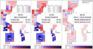
MI-05 The 5th district is one of the most fascinating in Michigan. Stretching from Flint and Saginaw in the south to lakefront Iosco County in the north, it has long been friendly ground for Democrats. Dan Kildee has represented it since 2012. Before that, much of the Genesee County portion was overseen by his father Dale. Before 2002 redistricting the 5th excluded Flint entirely, instead joining the lakefront counties with the "thumb" to create a Democratic-leaning district held by Democrat Jim Barcia.
The younger Kildee has never faced a truly competitive race. Like Kaptur and Ryan, he has had no difficulty outrunning the top of the ticket in Presidential years. In 2012 he won by 34 points with 65% of the vote, well ahead of Obama's 22 points and 61%. 2016 saw his margin shrink significantly, very much like Ryan's, while still far exceeding Clinton. Four years later, Kildee bested his first credible Republican opponent: state Representative Tim Kelly. He won by just 13 points, the slimmest margin of his career. Considering Biden took the district by just 4, Kildee's somewhat lopsided margin is rather impressive. Kildee drew 54.5% of the vote to Biden's 51.4%; the 5th has gotten 18 points redder at the Presidential level since 2012.
IN-01 For almost forty years, northwestern Indiana was represented by Democrat Pete Visclosky. He first ran for Congress in 1984, challenging one-term Democrat Katie Hall in the primary. Hall, the first black Congresswoman from Indiana, narrowly lost. She barely won Lake County despite its higher black population, and couldn't make up the deficit in the more hostile Porter and LaPorte portions. Over the ensuing decades, Visclosky was never dealt a competitive race. He retired in 2020, leading Frank Mrvan to run for the seat. Bolstered by his beloved family name and the perennial candidacy of Mark Leyva, the North Township Trustee won easily. The new seat is relatively unchanged, clocking in at just a bit more Republican than its predecessor. Mrvan starts off as a strong favorite despite the inauspicious nature of the national environment and recent trends for Democrats.
In 2012, Visclosky won by 35 points with 67% of the vote. That put him about 10 points ahead of President Obama, who carried the 1st by around 24 points. In 2016 Republicans did not field a candidate for Congress, but the party saw its fortunes improve districtwide at the topline. Clinton carried the former steel hub by 13, a ten point drop in the Democratic victory margin in just four years. Her 54% of the vote was down from Obama's 61% benchmark. Slippage into 2020 was mild, with Biden garnering about the same share of the vote even though the overall Democratic margin sank into single-digit territory. Mrvan's margin was almost double that of Biden. Overall the 1st has gotten 15 points redder at the federal level in the last eight years.
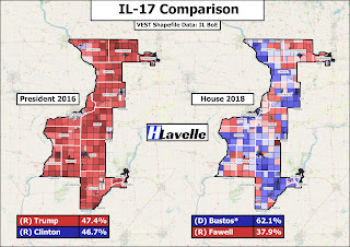
IL-17 From 1983-2007, much of the modern-day 17th was represented by Democrat Lane Evans. A progressive workhorse, Evans was never afraid to advocate party-line stands, even when it meant countering the Reagan Administration in a district that had helped to elect it. Always perceived as someone who would never act against the best interests of his constituents, Evans faced little pressure at the ballot box. The debilitating effects of Parkinson's forced him to retire in 2006. Phil Hare, an Evans aide, ran for the seat and won twice. He lost to Bobby Schilling in the carnage of 2010. In 2012, Democrat Cheri Bustos brought the 17th back into the fold. She has held her Driftless Area-based district easily since then, with 2020 constituting her only close race. Her unexpectedly-narrow 4 point win was probably the primary stimulant behind her decision to retire next year.
The 17th was markedly Democratic in the Obama-era, but became more potable for Republicans under Trump. In 2012, it was the only district on our list where the Congressional Democrat actually underperformed the President. Facing a Republican incumbent, Bustos won by just 7 while Obama romped to a 17 point blowout. The next two Presidential contests were different stories. In 2016, Trump narrowly carried the seat - a rightward swing of almost 18 points. Bustos cruised to a third term by 20 points, winning every county in her district. Polarization seems to have made her life harder in 2020 in the same way it prevented Collin Peterson from holding on in his ruby red district. Trump only narrowly won the 17th last year, leading Bustos to face the closest race of her career. Since 2012, the 17th has swung almost 19 points rightward at the Presidential level.

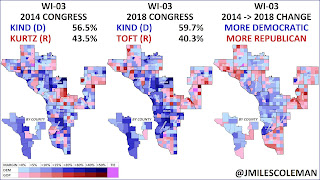
WI-03 For the last half-century, the 3rd district has encompassed much of southwestern Wisconsin. This corner of the Badger state lies in a region known as the Driftless Area. Under its current lines, the southern-most portion of the seat is located just above Cheri Bustos's 17th district. Both seats have experienced similar Presidential trends. Since 1996, the 3rd has voted for Democratic Congressman Ron Kind. Apart from the abysmal Democratic year in 2010, Kind has never faced a competitive reelection bid. That all changed in 2020, when undersold Republican challenger Derrick Van Orden came just three points away from beating the veteran incumbent. Like Bustos, Kind is retiring ahead of a midterm that could end up being a repeat of 2010.
Like its southern neighbor, the 3rd was reliably Democratic in the Obama-era. The former President carried it by 11 in 2012, but Kind blew the doors off to win by 28 points with 64% of the vote. (That was a full 10% more than Obama could muster) In 2016, he was unopposed as Trump flipped the seat into GOP hands by a 4.5 point margin. 2020 saw Kind outlast the rising tides of polarization, utilizing ticket-splitting to win by 3 points as President Trump carried the 3rd by nearly 5 points. Between the 2012 and 2016 Presidential elections, Kind's district swung rightward by about 16 points.
Kommentare
Kommentar veröffentlichen